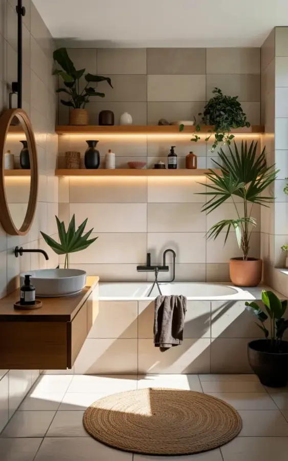
Look at that photo again. The beige tiles, the white oval tub, the terracotta palm plant. It all seems simple, even obvious. But there’s one quiet detail holding the whole scene together: the hidden LED strips underneath each wooden shelf. Without them, those shelves would just be a flat row of pale wood against a lighter wall. The floatingbathroomshelves in that image aren’t there to store shampoo bottles. They’re there to glow, and that’s a lesson most people never learn until after they’ve installed their own and wondered why it all looks so ho-hum.
The most common mistake with floating shelves in a modern bathroom isn’t the shelf itself. It’s the lighting, or rather the complete lack of it. You can copy that exact shelf layout, buy the same potted plants, even match the ceramic vases. But if you skip the light strips, you’ll get a flat, forgettable installation. Honestly, I’ve seen it happen too many times to count.
Why hidden LED strips make floating shelves look expensive
Large-format beige tiles are great. They’re warm, neutral, and easy on the eye. But they also absorb light and create zero contrast on their own. When you mount a wooden shelf against a wall like that, the wood just disappears unless something forces it to stand apart. Undermount LED strips do exactly that. They wash light down across the tile, and the shelf becomes a crisp, floating line with a soft halo underneath.
That glowing edge is what gives the whole bathroom a custom, expensive feel. Not the shelf itself. Not the ceramics. The light. I’ve walked into bathrooms with ninety-dollar shelves that look high-end simply because the owner took thirty minutes to install a cheap LED strip. And I’ve seen two-hundred-dollar walnut shelves look like a dorm room because the only light was a ceiling fixture directly overhead.
The point is simple. If you skip the lighting, you’re not saving money. You’re wasting it.
The floatingbathroomshelves lighting mistake everyone makes
So what does the wrong lighting actually look like? Here are the usual suspects:
- Visible light bars screwed onto the front of the shelf, which ruin the clean line.
- Cool white or blue-tinted LEDs that turn warm wood into a sterile gray.
- No lighting at all, assuming the bathroom’s main light will be enough.
- Plug-in strip lights with dangling cords that look worse than no light.
The photo above gets it right because the LED strips are hidden, warm, and continuous. They run along the underside of each shelf, casting a gentle glow that picks up the texture of the wood grain. Honestly, if you’re going to use floatingbathroomshelves in a modern bathroom, that warm underglow is the difference between “we renovated” and “we rented.”
One other thing: pay attention to color temperature. I always recommend 2700K to 3000K for bathrooms with wood and beige tones. Anything cooler will clash with the earthy palette.
How to add hidden LED strips without wrecking your minimalistbathroom
Ok so the good news is that hiding LED strips is not a huge project. You don’t need a custom carpenter or an electrician if you plan ahead. The cleanest approach is to buy aluminum LED channels with a frosted diffuser. These channels are shallow and can be mounted to the underside of the shelf, flush with the front edge. The diffuser spreads the light evenly and hides the individual little diodes.
The wiring is the tricky part. If you’re building the shelf into the wall, route a small channel behind the drywall and connect the strips to a dimmer switch. If you’re mounting shelves onto tile, you can hide the wires by running them down the grout line or along the wall edge. And here’s a tip nobody tells you: install the LED transformer in a medicine cabinet or under the sink, not behind the shelf, because you’ll want access when it fails.
There’s also a simpler route. Use a battery-powered LED strip with a remote, but only if the shelf is in a spot where you can’t see the little remote receiver. For that minimalistbathroom look, the receiver must be invisible. Otherwise skip it.
Styling with bathroomplants that look intentional, not cluttered
Let’s talk about the plants in that photo, because they’re doing more work than you’d think. A large palm in a terracotta pot anchors the right side. Smaller green plants spread out to the left, and there’s a black ceramic bowl and some brown woven details in between. The arrangement feels relaxed, but I promise you it’s deliberate.
Here’s a rule I use for shelvestyling with plants: odd numbers, varying heights, and at least one empty spot. Three or five plants across a multi-shelf setup looks natural. Two or four starts to look like a store display. And you don’t need to cover every inch of wood. Let the shelf breathe. An empty section with just a ceramic vase is as important as the busiest spot.
Bathroomplants also have a practical advantage. Your bathroom is humid and often bright, which is exactly what ferns, palms, and pothos love. So don’t feel weird about putting a plant up there. Just don’t overdo it. A jungle looks cluttered; a single layered grouping looks intentional.
Shelvestyling 101: what goes on your shelves and what doesn’t
In the photo, the shelves hold plants, ceramics, and a small brown object that might be a soap dish or a cup. No plastic bottles. No toothbrush holder. No shampoo bottles. That’s not an accident. When you’re styling floating shelves in a modern bathroom, the stuff you leave off matters more than the stuff you put on.
Ask yourself: does this object look like it belongs in a hotel spa? If not, it goes in a cabinet. Basic bathroom products are for storage spaces, not for display. I know it’s tempting to show off your nice amber-glass hand soap, but trust me, a single beautiful ceramic vessel will do more for the room than twelve similarly styled bottles.
Also think about the colors. The photo uses black, white, brown, and natural wood. Every plant pot and ceramic piece falls into that limited palette. That’s why it looks composed. If you add a bright teal vase or a red candle, you’ll break the spell. Keep the palette tight, and the whole shelf will feel like one intentional piece of art rather than a random collection.
One more mistake that ruins modernbathroomdesign: ignoring the wall behind
This one might be obvious, but people still do it. The shelf material and the wall tile need to work together. In the photo, the wall is beige tile with a warm undertone, so the wood shelves are a lighter natural oak. If that wall were cool gray or white subway tile, the same wood might look orange or dirty. You have to match the warmth of the wood to the warmth of the tile.
And don’t forget the thickness of the shelf. A thin shelf looks fragile on a heavy tile wall. A chunky, one-and-a-half-inch shelf looks solid and intentional. That’s a detail you’ll never see in a render but feel immediately in person.
Modernbathroomdesign is about getting the small choices right. The wood species, the tile joint width, the location of the towel bar, the hidden light strips. A question I always ask myself is, “What would happen if I removed one thing?” If the answer is “everything looks better,” then I had too much stuff on the shelf. That’s a good exercise for anyone.
Anyway, the takeaway here is simple. Don’t be lazy about lighting. Your floating shelves deserve more than a ceiling fixture.
Save this photo for your own bathroom refresh. Then look at your shelves and ask what’s missing. If the answer is “light,” you know exactly what to do next.
Leave a Comment