Look, I get it. You walk into the paint store, grab a dozen swatches of neutral bathroom paint colors, and somehow they all look the same. But then you get them home, slap them on the wall, and… disaster. That “Cloud White” suddenly looks like old milk. That “Soft Beige” turns straight-up Pepto-Bismol pink. Why? Undertones. And you’re not alone. I’ve made this mistake more times than I care to admit, and I’ve painted my bathroom three times in two years because of it. So let’s stop picking the wrong neutral, okay? Our color palette guide has 19 tested shades (yes, we actually painted and lived with them) so you don’t have to waste a single weekend or a single dollar on a color that fights your tile.
Why undertones are the real culprit in neutral bathroom paint colors
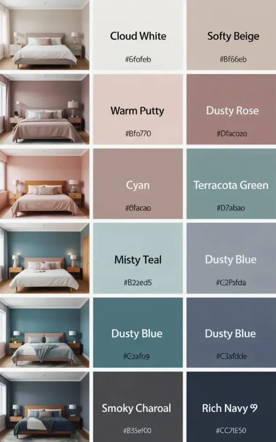
I used to think “beige is beige.” Ha. No. Here’s the thing: every neutral has a secret color hiding underneath. It could be green, pink, yellow, blue, or even a whisper of purple. And in a bathroom, with all that moisture and weird lighting from a single vanity fixture, those undertones scream. Not gonna lie, my first bathroom attempt was a “Soft Beige” that turned into a weirdly warm salmon after I installed the mirror. Look at the palette in the photo above: see how Soft Beige sits next to Warm Putty? They are not the same. Not even close. Warm Putty has a golden-brown base. Soft Beige leans peachy. That matters when your floor is cool gray marble. So the first mistake? Choosing a neutral without checking what color its “skin” really is.
Honestly, the easiest way to spot undertones is to hold a pure white piece of paper next to your swatch. The paper acts like a truth serum. That Cloud White? Next to bright white it can look a tad greenish, which is actually perfect for neutralizing pink-toned walls. But if you want a true warm white, you want something more like Warm Putty. I keep telling people: don’t trust the paint store lighting. It’s lying to you.
The top 3 mistakes people make when picking neutral paint for bathrooms
- Mistake 1: Forgetting the trim color. Your baseboards and vanity are already a white, and they will tint everything you see. I painted one bathroom with a creamy beige and my builder-grade white trim made it look dirty, like someone had wiped their hands on the wall.
- Mistake 2: Ignoring the undertone of your tile. If your floor has a blue vein in it, don’t slap a yellow-beige on the walls. The contrast will look like a bad fight. Instead, reach for a neutral that shares the same undertone family, like a greige (gray + beige) or a cool white.
- Mistake 3: Only testing one coat. Two coats minimum. And let it dry fully. One time I tested a “Dusty Rose” and loved it wet, but dry it turned into a weird fleshy tone. I cried for a solid ten minutes. Don’t be me.
And hey, while I’m ranting, always test on the actual wall, not on the cardboard swatch. The wall has texture, old paint layers, maybe even a bit of wallpaper glue from 1987. That changes everything.
How to read our 19-shade palette (and find your calm neutral)
Take a good look at the photo that goes with this article. The top row is all warm neutrals. Cloud White is that nearly white off-white with a whisper of warmth, it’s my go-to for small windowless bathrooms because it bounces light like crazy. Soft Beige is next, and it has a pinkish undertone that works beautifully with brass fixtures. Warm Putty is the deeper golden-tan that makes a bathroom feel like a spa. Then you get to Dusty Rose, which is actually a blush neutral, not a pink, think dusty desert sunset. Cyan and Terracotta Green round out the warm side; they’re more adventurous, but if your bathroom has wood cabinets they can be stunning.
Now slide your eyes to the bottom row. Cool tones. Misty Teal is a soft green-blue that makes white marble pop. Then three Dusty Blues, yeah, they repeated the name in the photo (don’t ask me why, maybe the designer ran out of label space). But look at the actual colors: one is a washed-out denim, one is slightly gray-blue, one leans more gray-slate. That’s what I mean by undertones even within the same name. Smoky Charcoal and Rich Navy are your grounding shades, great for an accent wall behind the toilet or in a powder room where you want drama. Not gonna lie, I almost painted my entire guest bath Smoky Charcoal, but my spouse talked me into just one wall. Smart move. Now the room feels cozy instead of like a cave.
Warm neutrals vs cool neutrals: a simple breakdown for your bathroom
Here’s the trick I use with friends all the time. Look at your shampoo bottle. I know, weird. But if your bottles are mostly white, blue, or green (like a typical men’s body wash or a sea-salt spray), you probably like cool tones. If your shelf is stacked with honey-colored soaps and amber glass bottles, warm neutrals will make you feel at home. Your bathroom should reflect the vibe of the products you already love.
But watch out, bathrooms have a humidity thing that warm neutrals can go yellow in. I’ve seen Warm Putty turn the color of an old banana peel after a year in a steamy shower room. So if your bathroom gets steamy every single day, maybe stick to Cloud White or a light greige. The Misty Teal from our palette is also a safe bet because it stays crisp. Cool neutrals like Dusty Blue or Smoky Charcoal don’t yellow. Ever. They just stay themselves. That’s comforting to know when you’re spending good money on paint.
Lighting is the silent enemy of your neutral bathroom paint colors
I had a friend paint her entire bathroom in “Soft Beige” (the exact shade from the palette) and it looked pink in the morning, orange at noon, and gray at night. Same color. Different times of day. The issue was her bathroom has a skylight and a tiny warm bulb above the mirror. That skylight poured in cool north light, turning the beige mauve. The bulb fought back with yellow light. The wall couldn’t win. So here’s what I actually do now: I buy those sticky-note swatches (the ones you can peel off) and stick them on three different walls: one in direct light, one in shadow, one near the mirror. Then I check them at 9am, 3pm, and 8pm. Yes, it’s annoying. No, you don’t have to do it. But if you don’t, you might end up like my friend, repainting in twelve months.
Another lighting trap? The vanity light itself. Those three-lobed round fixtures cast shadows that make your paint color look different on the ceiling versus the wall. Ceilings always look a shade darker because they get less light. So if you want that soft Cloud White on all surfaces, consider doing the ceiling in a flat version of the same color, the flat finish mutes the light differently and it can look like a whole new color. I learned that from a painter who smelled like coffee and wisdom.
Our top picks from the palette for a truly calm neutral bathroom
If I had to choose just three for a serene bathroom makeover, here they are. First, Cloud White. It’s forgiving of mistakes, it works with any metal finish, and it makes the room feel three times bigger. Second, Warm Putty, but only if your bathroom has decent natural light and you promise to use a high-quality, low-sheen paint that resists steam. And third, Misty Teal for anyone who wants a hint of color without leaving the neutral zone. It’s green-blue but muted. It doesn’t scream “beach house,” it whispers “spa.” And for a bonus fourth, Smoky Charcoal on an accent wall behind the toilet or inside a shower niche. That rich navy tone next to white grout? Chef’s kiss.
By the way, the palette in the photo includes Terracotta Green and Cyan, which I think are more daring. But if you have a big bathroom with a claw-foot tub and a plant that refuses to die, go for it. Terracotta Green is that muddy olive that looks amazing with brass. I almost did it in my own master bath but chickened out. Maybe next time. Anyway, the point is: don’t pick a color because it’s trendy. Pick one that makes your eyes relax when you walk in.
Practical tips for testing without painting your whole bathroom
Ok so you’ve seen the palette. You’ve read the warnings. Now what? Buy sample pots. Here’s a weird thing I do: I paint a piece of poster board (the kind from the drugstore) with two coats of the color, then I cut it in half. I tape half near the shower, half near the mirror. Then I take a shower. With the shower running. The steam settles on the painted board, and I can see if the color changes when wet. Honestly, it should never change, but some paints, especially cheap ones, have a chameleon effect when damp. If Cloud White suddenly looks like it has a green shadow when wet, run. Also, check the color under your shower water. If your water is hard (orange or yellow tint), it can stain lighter neutrals over time. That’s a real thing. So maybe avoid Cloud White if your water leaves rust rings. Warm Putty hides that better.
And one more thing: don’t forget the ceiling. I once left a ceiling white while the walls were Soft Beige, and the contrast made the room feel like a box. Next time I’ll paint the ceiling the same color as the walls (just one shade lighter or the same in a flat finish). It makes the room feel taller and more wrapped in calm. That’s my opinion anyway. Take it or leave it.
So there you have it, 19 tested shades, lots of trial and error, and a palette that actually works. Cloud White, Warm Putty, Soft Beige, Dusty Rose, Misty Teal, the Dusty Blues, Smoky Charcoal, Rich Navy… they’re all in the photo above. Stop picking wrong neutrals. Grab a sample, do a test, and give yourself a bathroom that feels like a spa every day. Good luck. And if you end up with a color that still looks weird? Just call it “modern art.” Seriously, it’s cheaper than repainting.
#neutralbathroom #bathroomcolors #paintcolors #neutralpalette #bathroomdesign
Leave a Comment